It’s just a couple of weeks before TC24 in San Diego… So we want to know what the weather is out there!
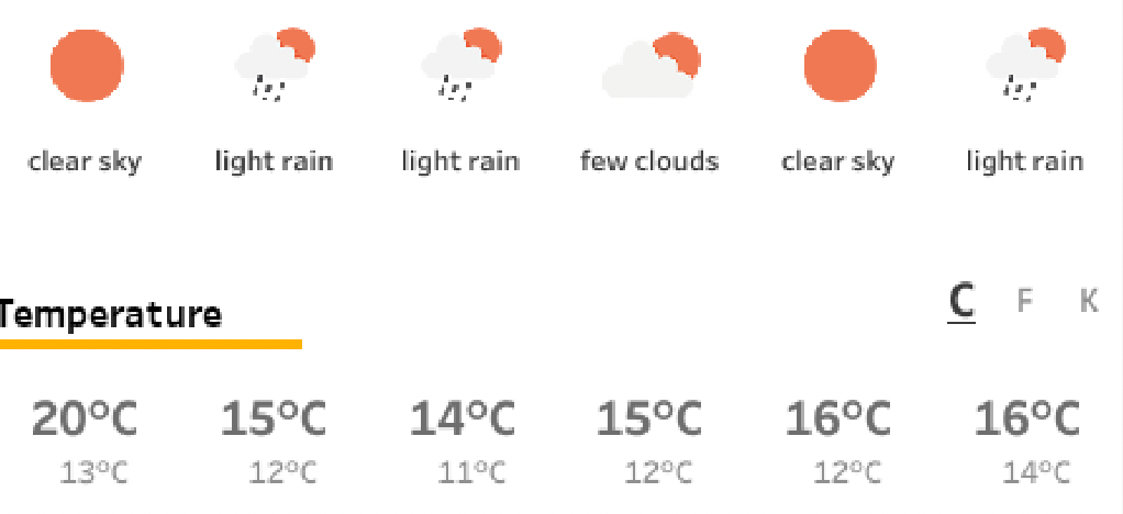
Or at home. Or any other place in the world.
What better than building your own weather forecast in Tableau!?
Antichaos
Tableau Consultancy & Analytics
It’s just a couple of weeks before TC24 in San Diego… So we want to know what the weather is out there!
Or at home. Or any other place in the world.
What better than building your own weather forecast in Tableau!?
The ‘shapes’ functionality in Tableau is a nice way to enhance and personalize a visualization. But be aware what exactly you are decoration – especially on maps.

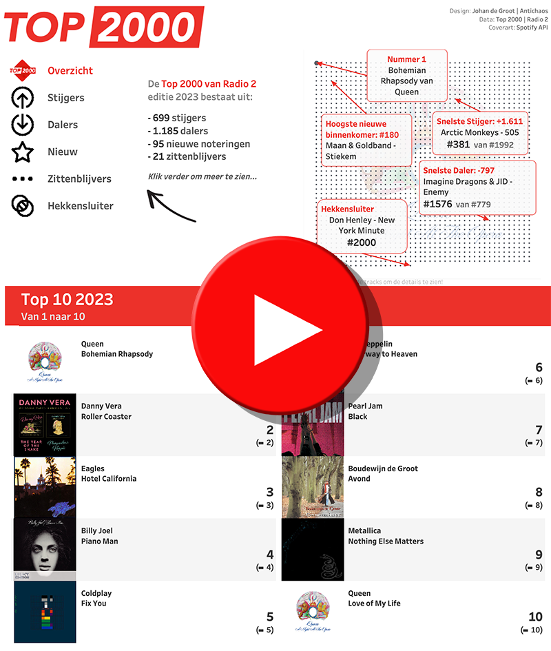
The Top 2000 of Radio 2 (a populair Dutch radio station) has been broadcast for the 25th time – and traditionally I am trying to turn this into a ‘different’ interactive data visualization…
Now and then you encounter data with ‘extreme values’. Values which are much larger than the other ones – and so hard to analyse.
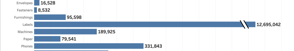
A dataset which is skewed like that needs to have a special treatment when visualized, because otherwise the individual values can’t be identified correctly.
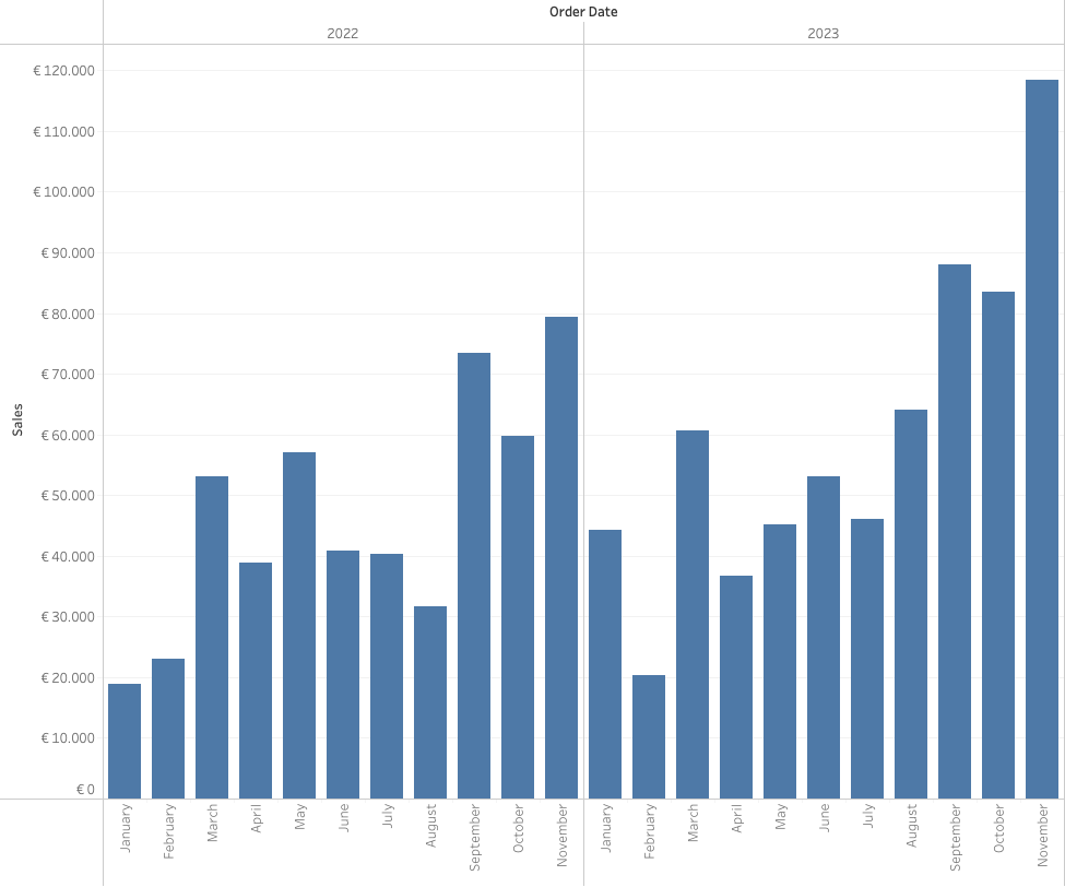
[Read more…] about How to visualize extreme values?Often improving a dashboard is about small changes. Have a look a this chart:
[This blogpost is part of a series tips tricks, as being presented at VizIt Berlin 2023]
[Read more…] about Improve layout of percentags – Better labels in Tableau