It’s that time of year again… – the Visualisation of the Top 2000 of Radio 2!
One of my traditions is to visualize the Top 2000 as being broadcasting by the Dutch radio station Radio 2 using Tableau.
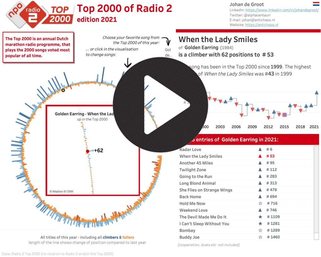
This time I choose a circular visualisation of the list, with a detailed/zoomed-in look at the chose title inside the circle. Changing a title can be done via the drop-down, but also by clicking in the circle (either one) or in the list of entries of the artist.
Used Tableau techniques are – among others – Map Layers, parameter actions, Level of Detail calculations and a little bit of Tableau Prep.
Biggest challenges of this dataset are – like each year:
- getting the data
- cleaning the data
but also:
- how to visualize a ranking list (best on #1, but ‘capped’ on 2000 entries each year)
- how to make sure all the names of both artists and titles are being showed correctly, independent of the length of these?
- what is the correct way to get a circular visualisation with these pesky sine, cosine and angle…
and – a small pet-peeve of mine:
- can you make the used texts dynamically to make sure they don’t look too automated?
Let me know what you think of it via mail of Twitter!
Be notified of new content…
If you find these tips and tutorials useful, you can follow (and connect) me on LinkedIn for all the latest content.