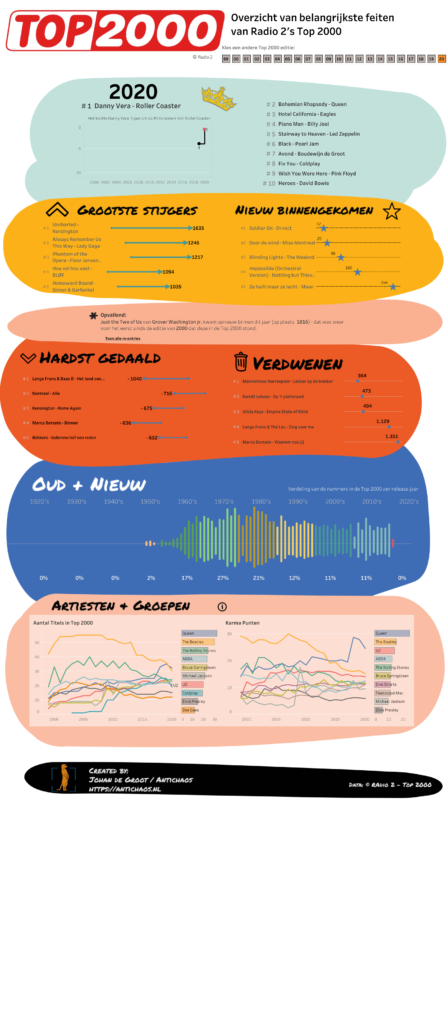
The Top 2000 edition of 2020 isn’t a fancy data visualisation with extensive data-preparation and/or mathematical formulas like last year, but a visualisation with the emphasis on what you can do with relative simple graphical elements. This approach can change the look and feel of a ‘standard’ dashboards significantly
Click on the screenshot to view – and use! – the data visualisation fullscreen.
Be notified of new content…
If you find these tips and tutorials useful, you can follow (and connect) me on LinkedIn for all the latest content.
Leave a Reply