One of the most impactful development tips I got during TC24 was a very small one, but I have used it a lot since then.
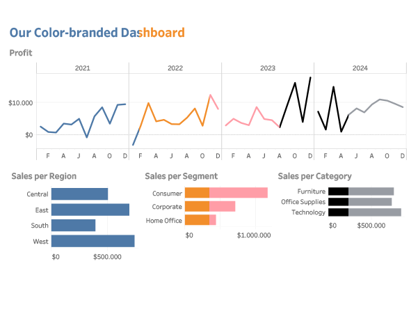
What is you have just finished your dashboard, and your manager/client/voice in you head tells you: I think the color of the charts need to be changed to pink…
[Read more…] about Change all colors at once