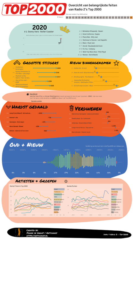
It’s that time of year again… – the Visualisation of the Top 2000 of Radio 2!
One of my traditions is to visualize the Top 2000 as being broadcasting by the Dutch radio station Radio 2 using Tableau.
This time I choose a circular visualisation of the list, with a detailed/zoomed-in look at the chose title inside the circle. Changing a title can be done via the drop-down, but also by clicking in the circle (either one) or in the list of entries of the artist.